This page is a collection of the art I did in my Creative Art class.
coming to life (2012)
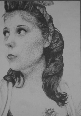
Our first big project of the year: scribble drawings! This project was definitely one I was looking forward to. I chose the picture I did because I really like the way the photograph turned out.
We began our projects by drawing one-inch gridlines on our chosen photo and two-inch gridlines on our poster board. We also cut a one-inch square out of an index card to use as our viewfinder.
To start off, we began lightly sketching the shapes of values that we could discern from the photograph. We were strongly encouraged to draw what we saw, and not what we thought we saw. This was much easier said than done. I forced myself to use the viewfinder at all times, as I noticed I had a habit of drawing something wrong when I didn't use it. I finally finished the pencil portion and was then able to move on to the ink portion.
This milestone of the project made me nervous. I was going to lose my eraser capability :( With pen, I had to begin to scribble. About the same time we had created the viewfinders, we were given a long strip of paper that we had to demonstrate how to use pen scribbles to create different values. We also had to choose whether we wanted the scribbling to be controlled or random. I started at the bottom row of gridlines, filling in each box with its respective amount of ink. There wasn't much to do at the bottom, so I was sufficiently bored until I reached the hair.
The hair took the longest. I used a gel ink ballpoint pen, and a controlled scribble technique: lines. I seemed to be making little to no progress, since it took a very excruciatingly long time to fill a small space in with black ink. But eventually I finished, and moved on. The bandanna was a challenge. But I was able to correct wherever I messed up, for the most part, enough that it looked pretty realistic.
When I reached the facial features, I was under a lot of pressure, knowing that if my pen slipped at all whatsoever it would result in a very noticeable black mistake. But I had a limited amount of time to finish my project, so I made myself get over it and continue working.
Then, I erased any remaining gridlines and was at last finished with my project! Although I was a bit disappointed that I ran out of time to fill in the background, I'm happy with the way it turned out.
lasso (2012)
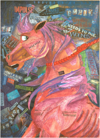
Our second major project was magazine collage paintings. To start, we got into groups to brainstorm issues in modern society. Then, we chose one to base our project off of. I chose animal abuse because it is a subject I feel strongly about and I knew I would be capable of creating a good design. Originally I wanted to draw two horses, one healthy and one mistreated, but the poster paper we were assigned to use was of different proportions than my sketchbook paper. So I eliminated the healthy one and decided to put my entire focus into the negativity of the abused horse.
First, I sketched the outline, lightly, so I could change things if I needed to. Then I started perusing some magazines to find ads or articles that I could relate to my topic. Fortunately, I had more than enough magazine material. I was afraid to start pasting the text onto my project, but again, I had a limited amount of time to complete it, so I forced myself to do it. It took me a considerable amount of time to finish collaging the magazine scraps, but I finally could start the paint.
The painting portion was interesting, because the technique we were told to use involved diluting the paint with water, so the magazine clippings could still be legible underneath. It was similar to using watercolor. It took me a little while to get used to it, but I ended up really liking the technique and I can see myself using it in the future.
My project turned out really great, I think. If I could go back and change something I did to improve it, I wouldn't have used such a dark acrylic for the horse's coat. Maybe then it would stand out against the indigo background a little more.
empty halls (2012)
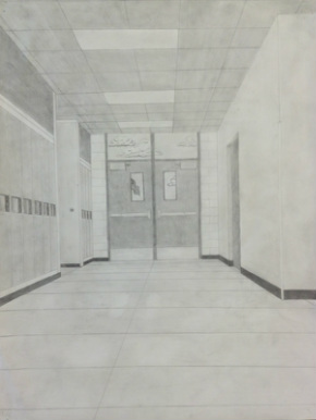
This project took me a while, due to the fact that it deals with using a ruler and vanishing points. We were told this project was a smaller one leading up to our next one (perspective drawing. But I'll get to that in a bit). Our assignment was to pick a spot in a hallway near to our classroom and draw it, using shading after the initial drawing to make the lines "disappear". I didn't particularly like this project just because I don't use a ruler often, and I felt clumsy with one. But I do like the way this project turned out, too, and I think I may have improved my skills with a ruler by the end of this, too.
89th street diner
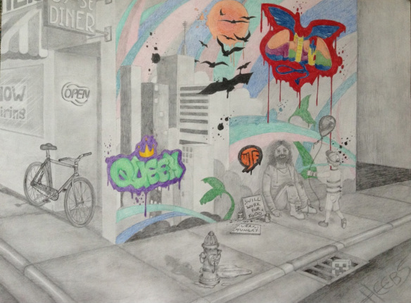
This project was also a challenge for me because I am so used to freehanding everything that using a ruler and vanishing points was actually really difficult. I restarted a few times, not liking the way my initial ideas looked when I sketched them out. In our project, we had to use two- or three-point perspective to create five buildings, with some windows and doors, and a sidewalk, and shade it in a way to make the lines "disappear" and THEN incorporate color somehow. My sketches were strikingly similar to those of my peers and I resolved to think of a layout that no one else would have come up with.
And then I had an ah-ha moment! I thought, instead of the buildings being the focus of the project, I would make a street corner the focus. I zoomed into a corner of a building and added a sidewalk, a diner on one wall, and an end-to-end graffiti piece on the other, incorporating the buildings INTO the graffiti.
The drawing portion took me a while, as did the shading, but it was well worth it. I added a few other extra things, too, like a bicycle, a fire hydrant, a boy giving a balloon to a homeless man, and a street drain grate. I left some places on the graffiti wall untouched by shading so I could color them, hoping it would draw the viewer's attention to that area of the project. Under (yet another) time crunch (these tend to haunt me when I take longer than I should on projects like this), I hastily colored the blank spaces with the pencils I had, and I don't particularly like the color combinations I used or the way they look on the paper, but I think overall this perspective drawing went from challenge accepted to challenge completed. Glad I'm done with it.
mini-project : forester
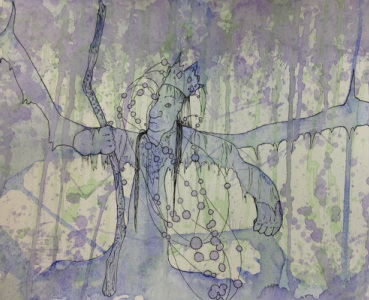
This project was one of my personal favorites. Even though it was only a mini-project, I really had fun with it. Our directions were this: using cups of watercolor set up around the room, we had to apply three colors of paint to a small sheet of watercolor paper without actually touching the paper. We were turned loose to experiment. Afterwards, when the paint was dry, we had to analyze our paper and look for something in the picture. For example, I saw a winged tree-like man holding a staff in my picture. Finding nothing else of interest, I decided to go with that. Then we were told to use pen to bring out whatever image we saw within our respective splatters of paint. I never got to outlining the wings I saw, or adding value, but I like this project too.
sweetness
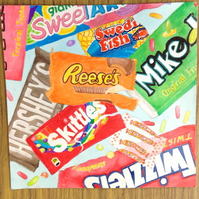
This was a project that was intended to give us the opportunity to improve our watercoloring skills. We again practiced drawing lightly, and making sure to draw exactly what we saw. After the candy wrappers had been sketched out, we watercolored them in a way that would "get rid of the lines" and make it look more realistic. Mine took a very long time to do, because I'm a perfectionist. But I like how colorful it is and I actually also really like the background color.
zebracorn
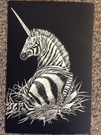
A scratchboard art piece!! Oh my gosh did this take me a long time. First we had to draw out an animal, or creature or whatnot, that took up 3/4 of the page. Then we outlined it with pen after taping it onto the empty scratchboard, so we would make indented lines on the board to help us see where the drawing is supposed to be, so we could get proportions right. THEN we used a thumbtack, or an XACTO knife, to scratch away at the black and reveal the white values of our drawing. I thought it would be a real challenge, having to "draw backwards" basically, starting with black and revealing the white values. But it came a lot easier than I thought it would. Of course, Miss Perfectionist took twice as long as everyone else. But she's happy with this project so it evened out : )
